Art Direction for a poetry book, balancing traditional letterpress techniques with raw illustration and typography.
-
The Collaboration
This project was a personal collaboration. Designing this debut collection was about more than just layout; it was about finding a visual language that could hold the words without intruding on them. We wanted the book to feel like a handcrafted object, moving away from the polished look of traditional publishing to something more honest and unrefined.
The Craft
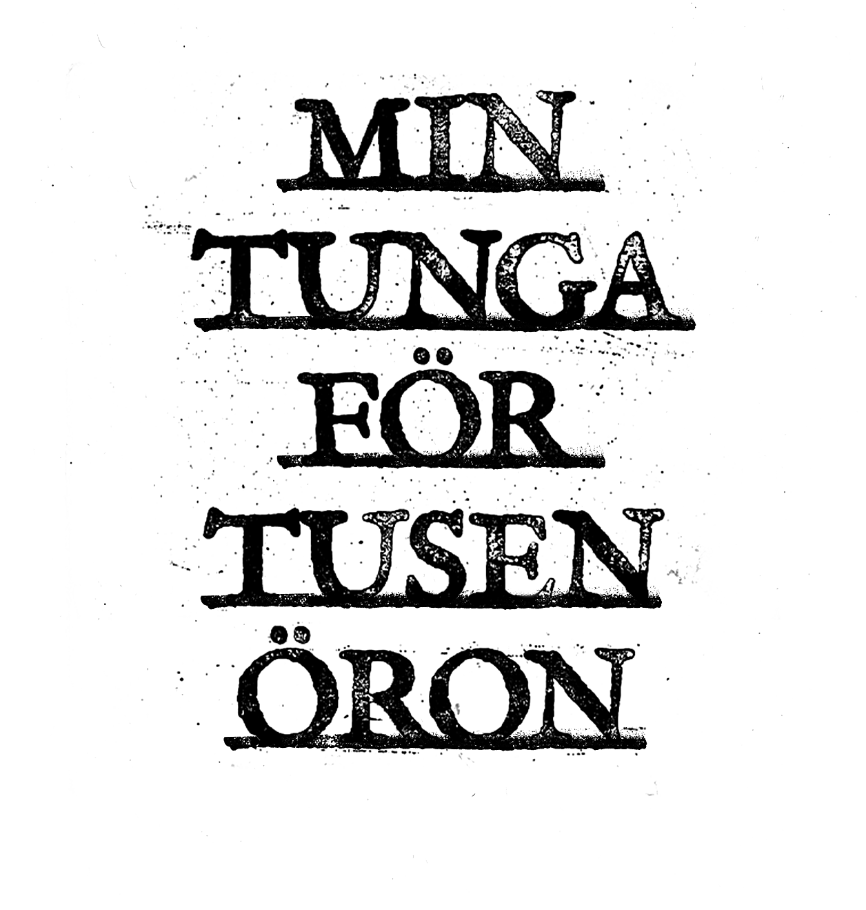
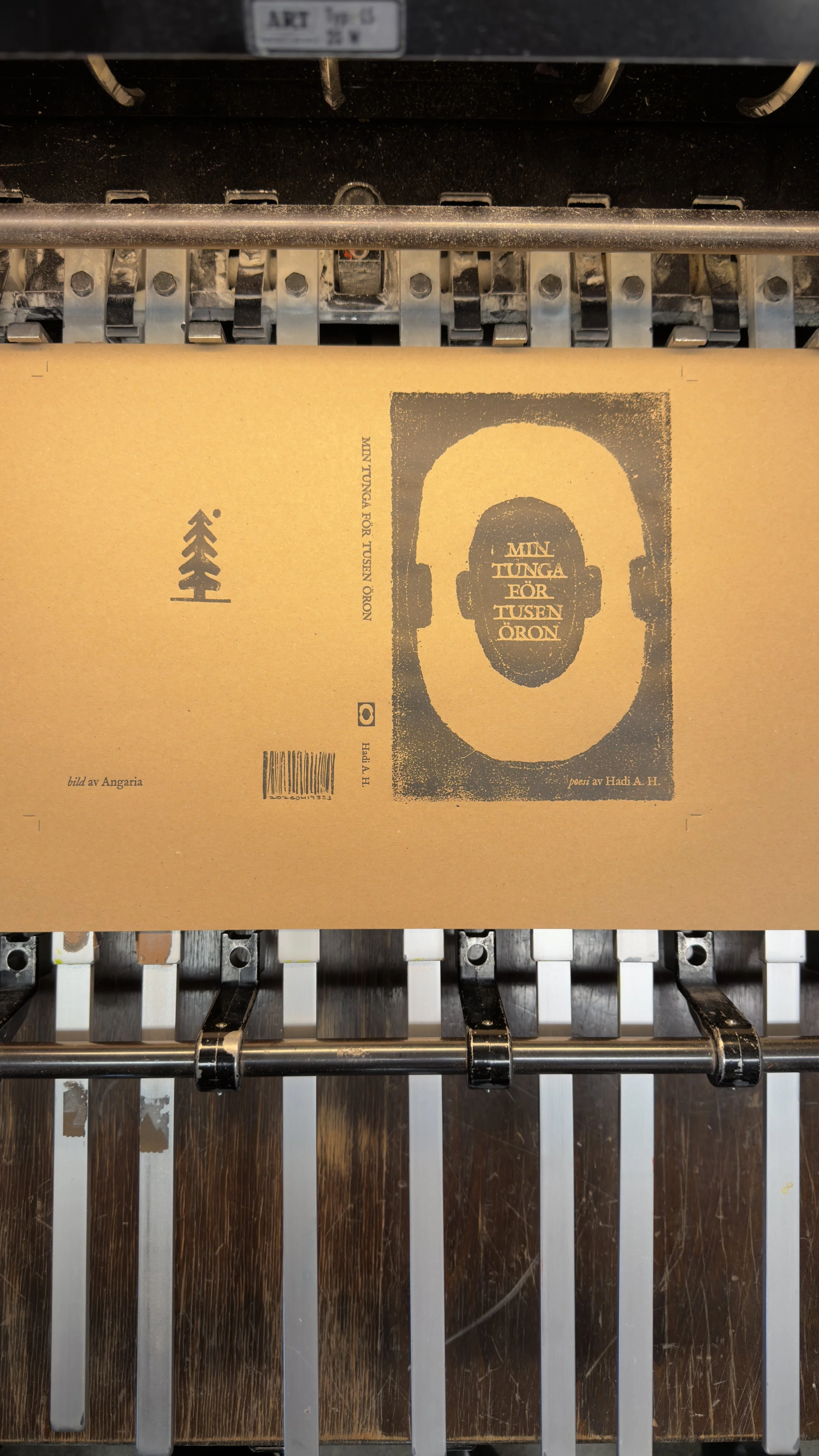
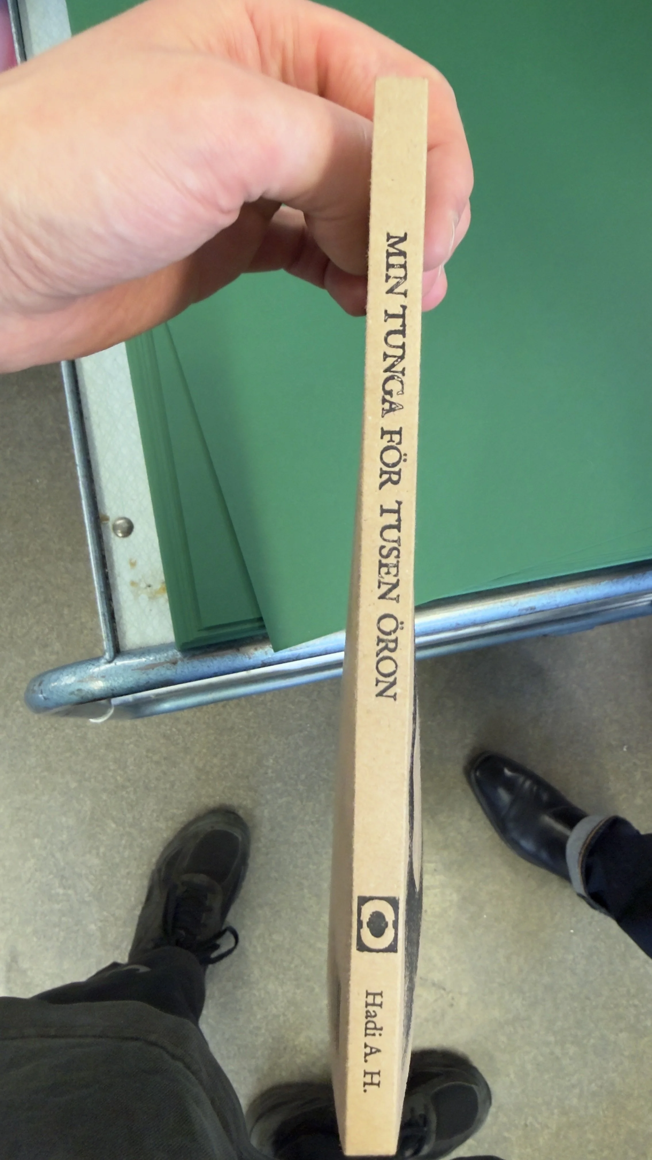
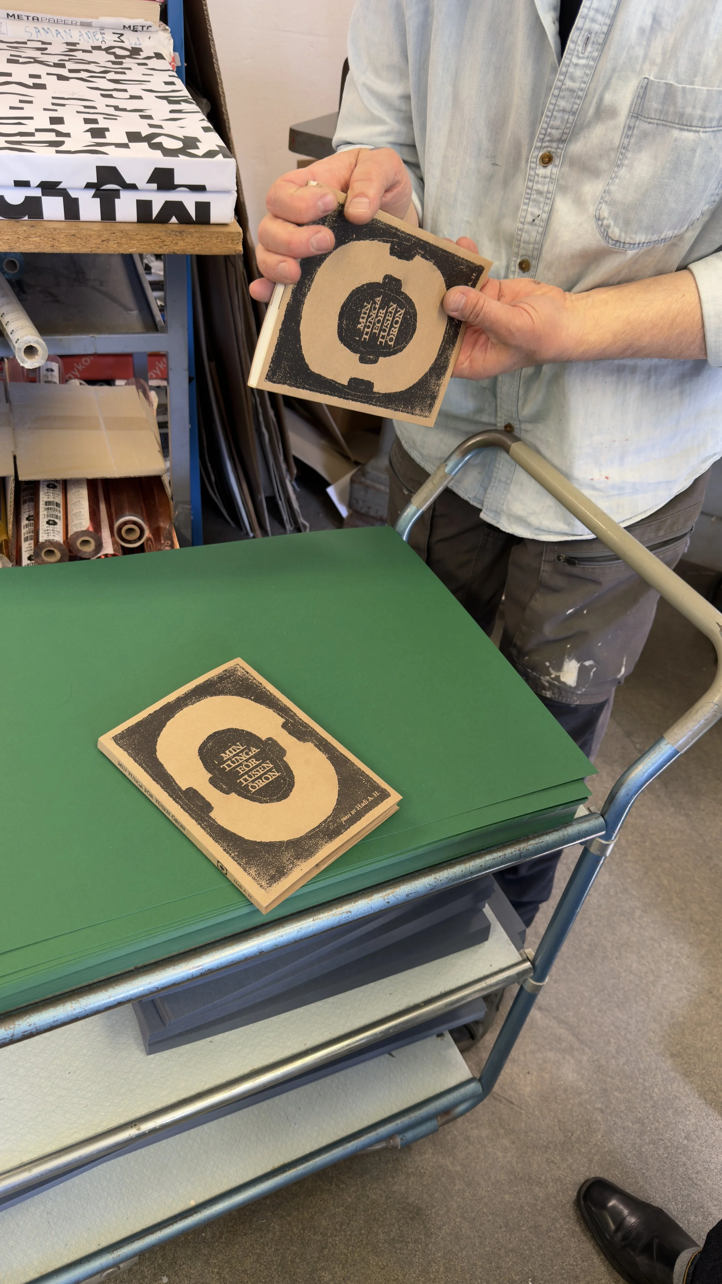
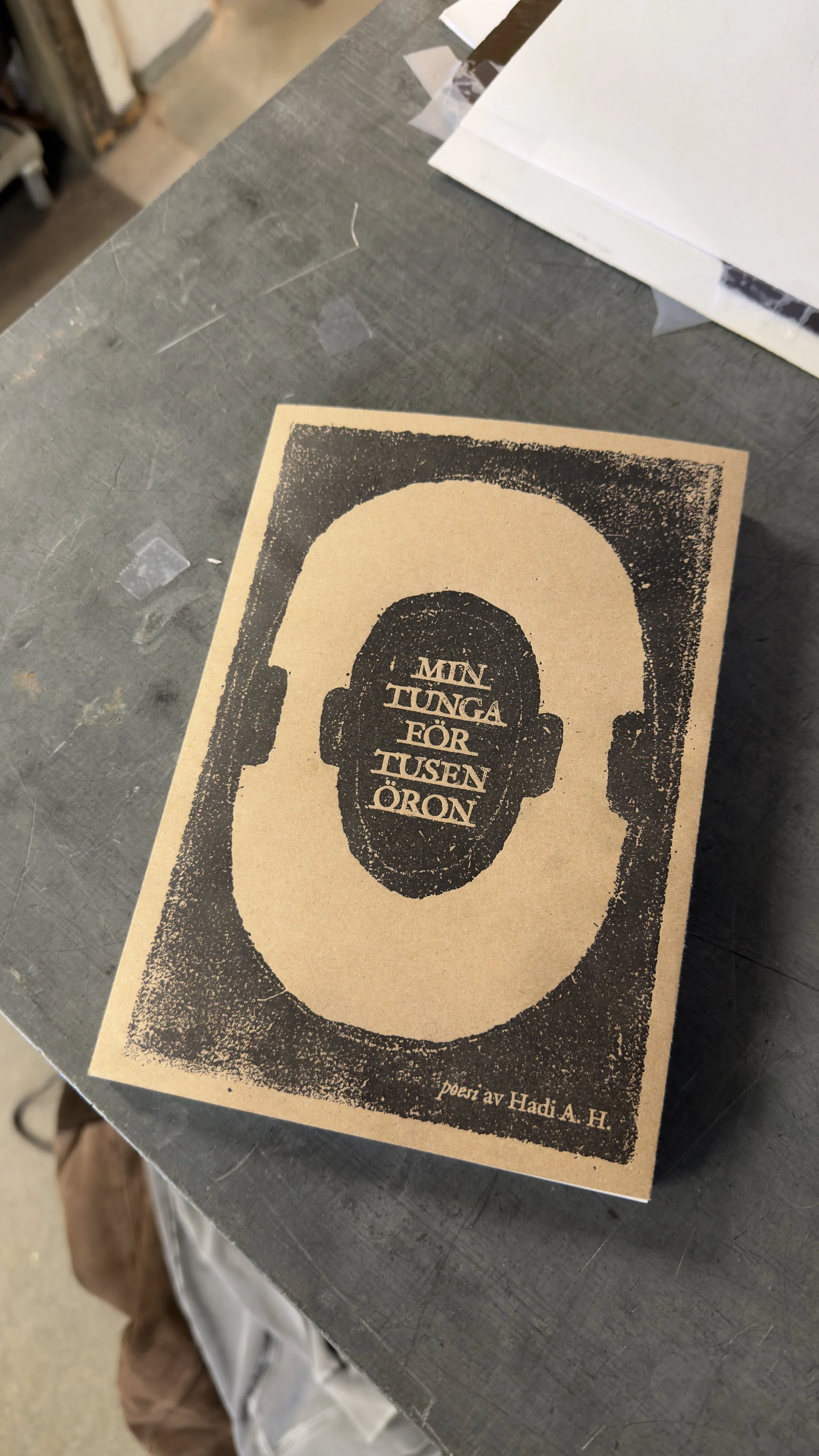
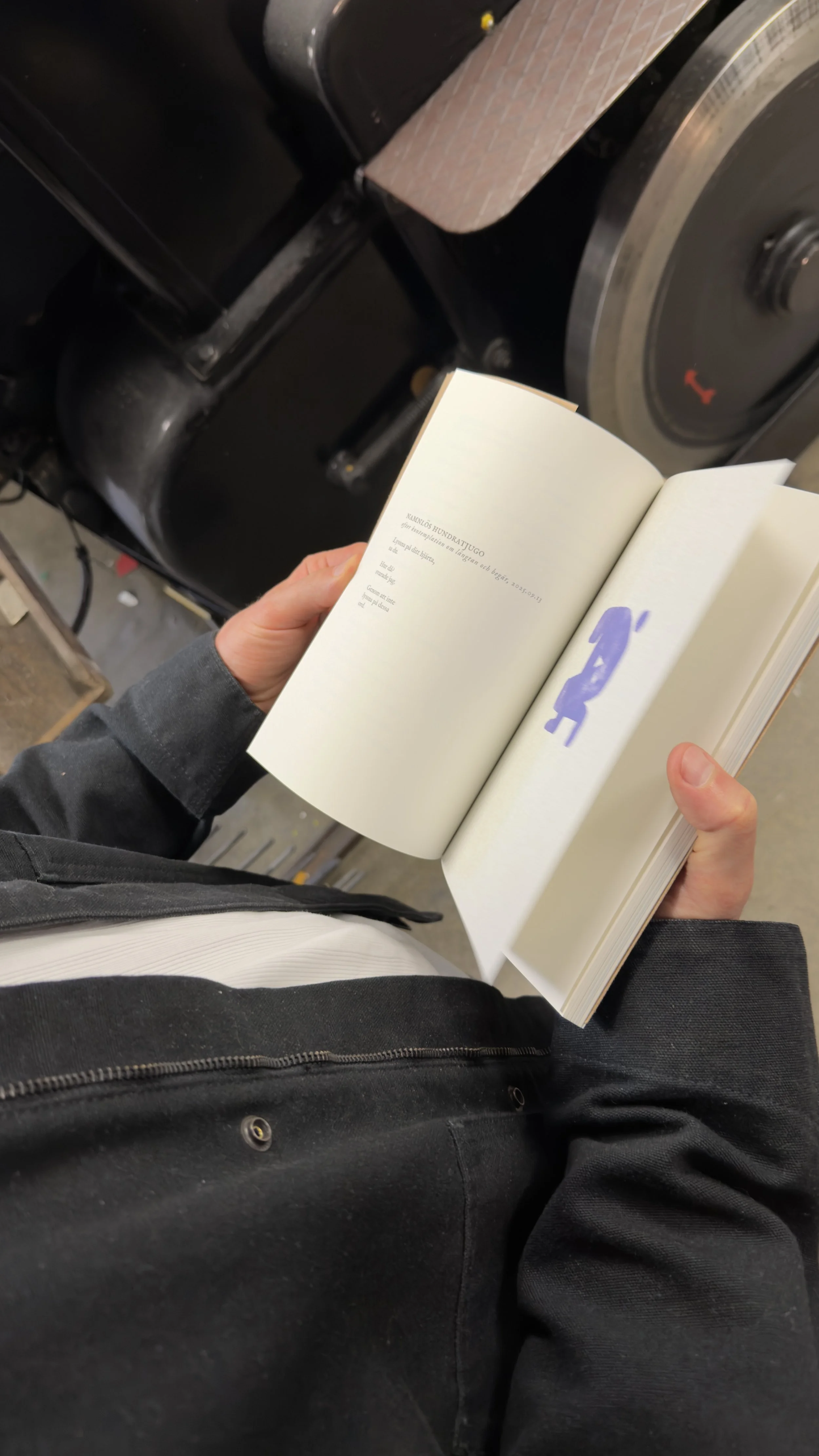
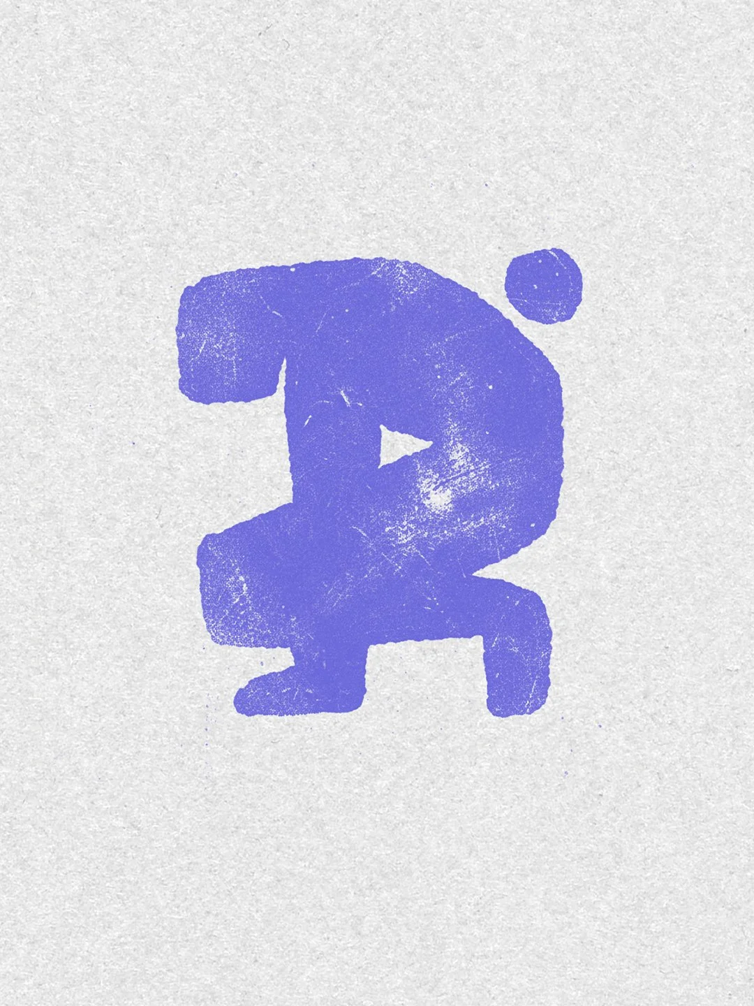
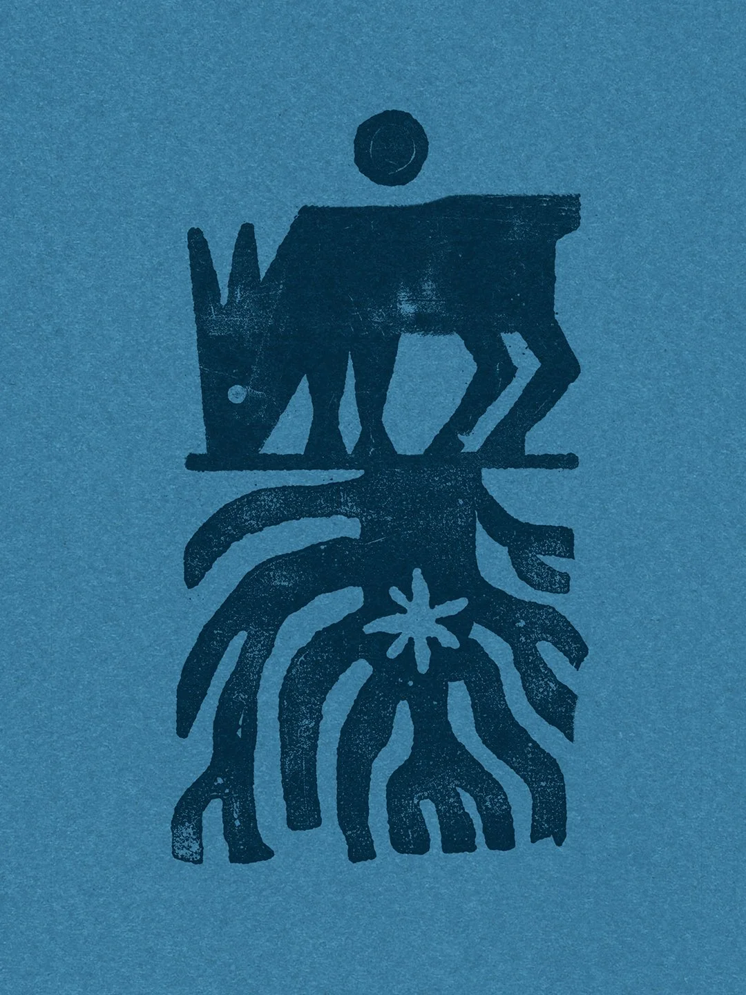
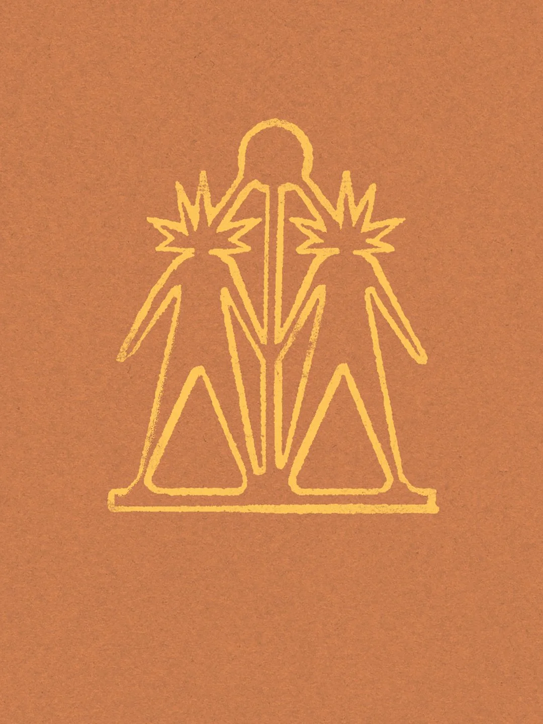
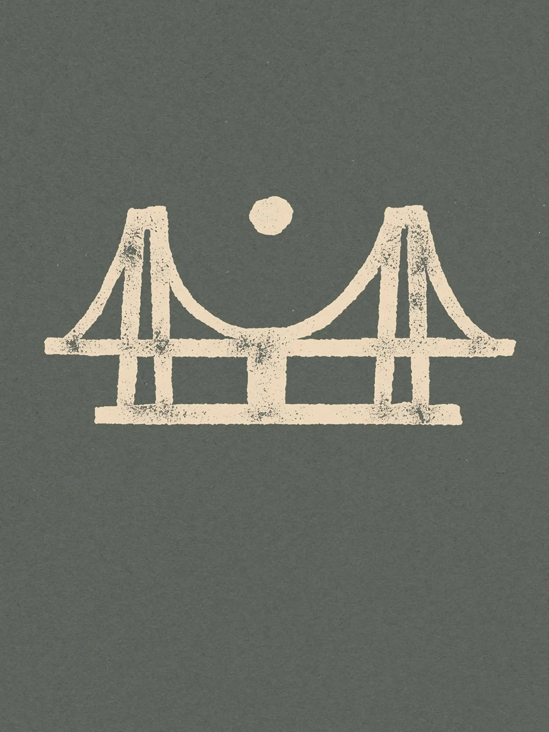
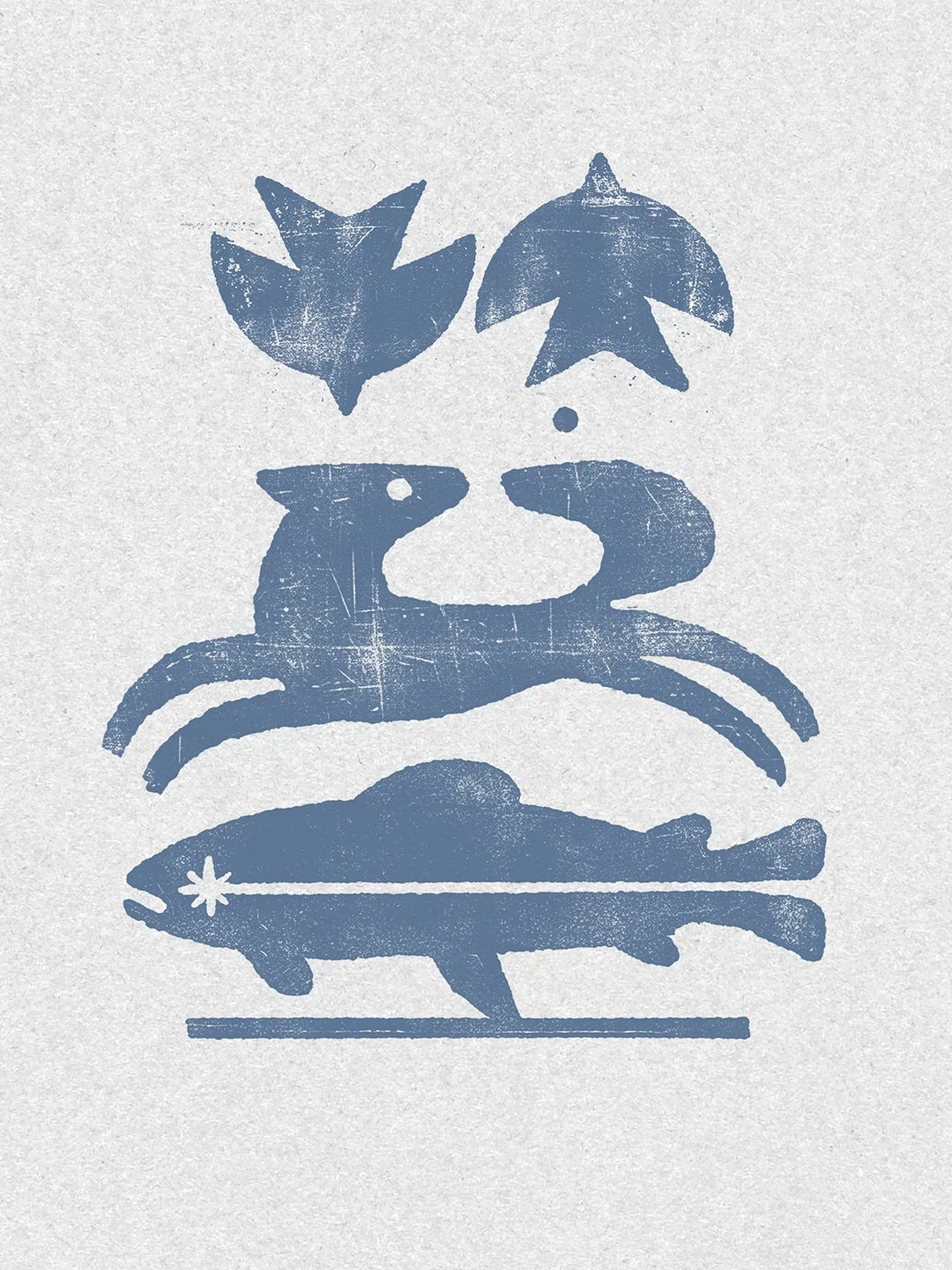
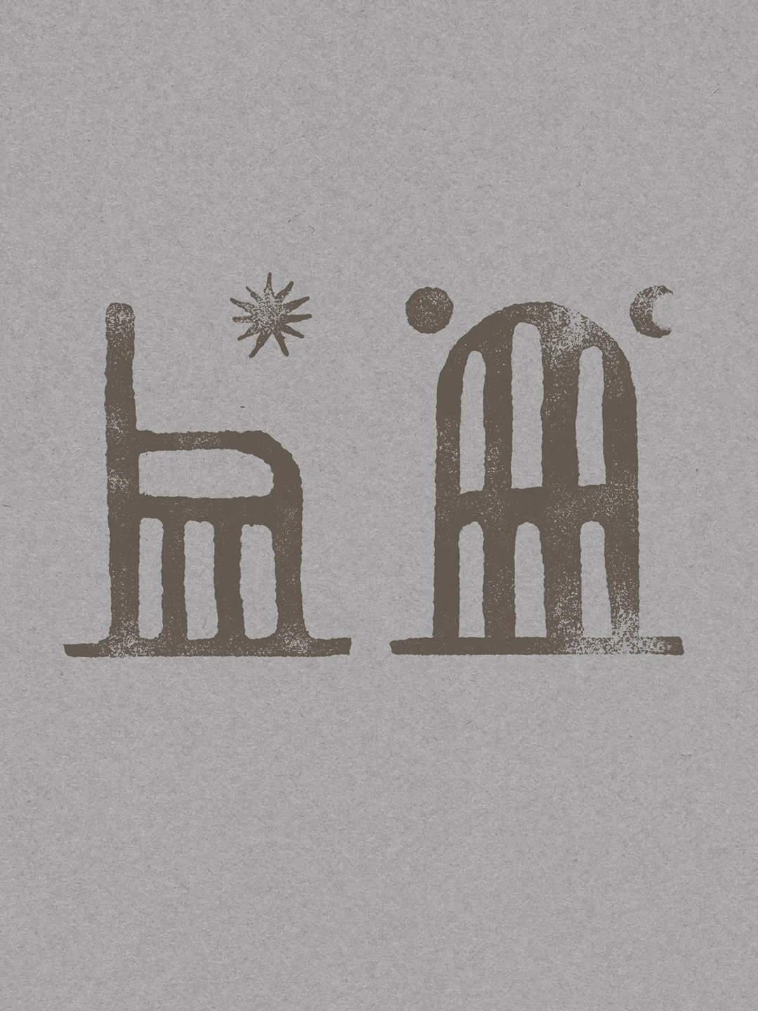
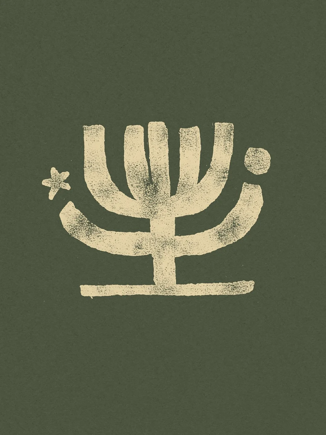
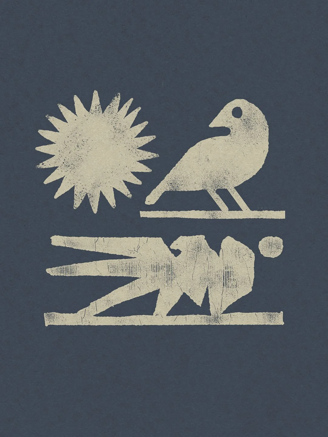
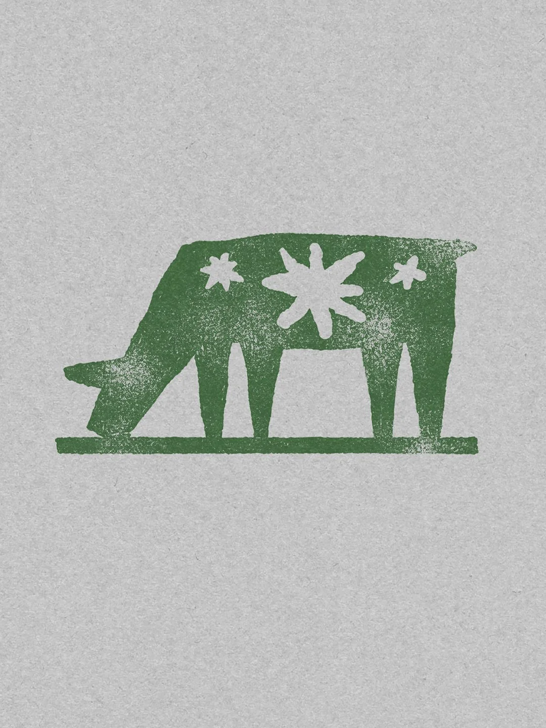
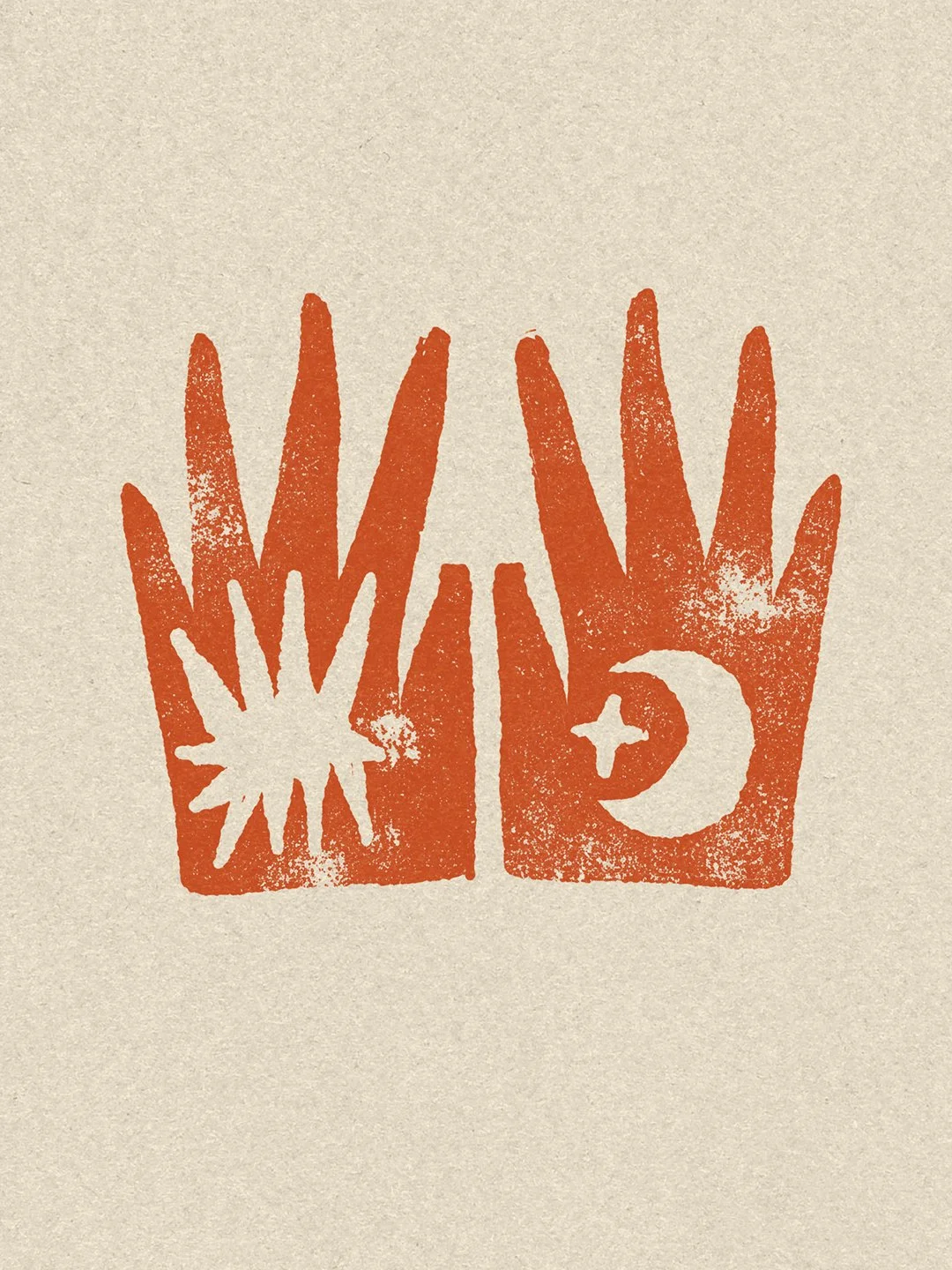
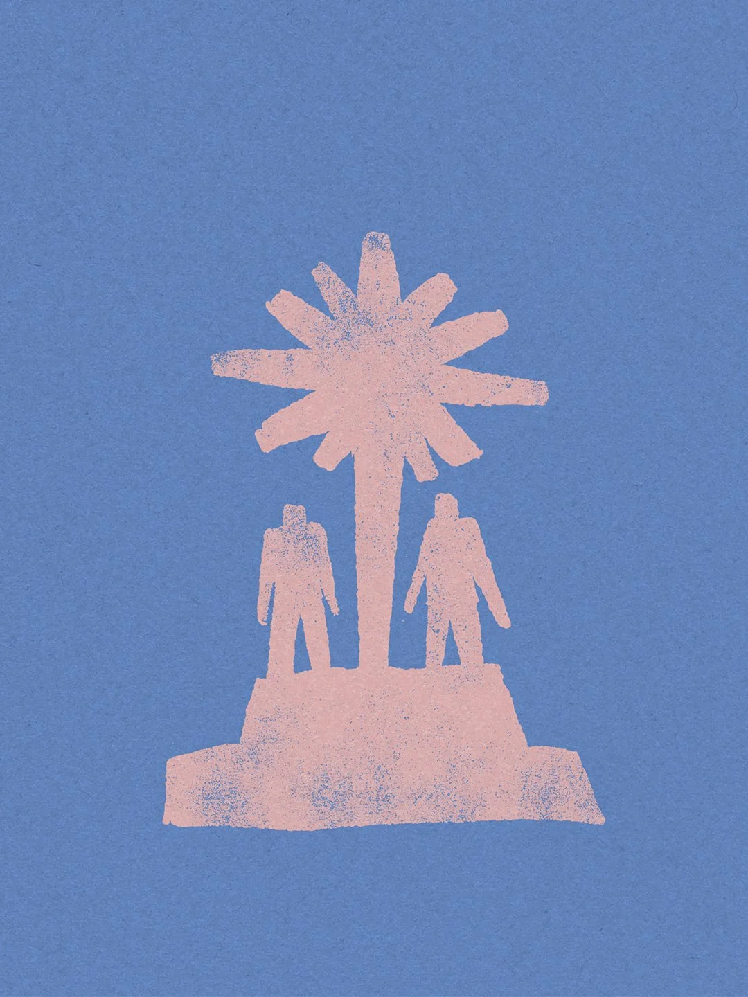
To mirror the raw and intimate nature of the poems, I chose to work with heavy textures and imperfect forms. I created a series of illustrations inspired by the grit of failed linocuts—rough silhouettes and animal symbols that act as open-ended emotional echoes. I paired these with the IM Fell typeface, chosen for its jagged, organic feel that resembles an old manuscript rather than a modern font.
Production
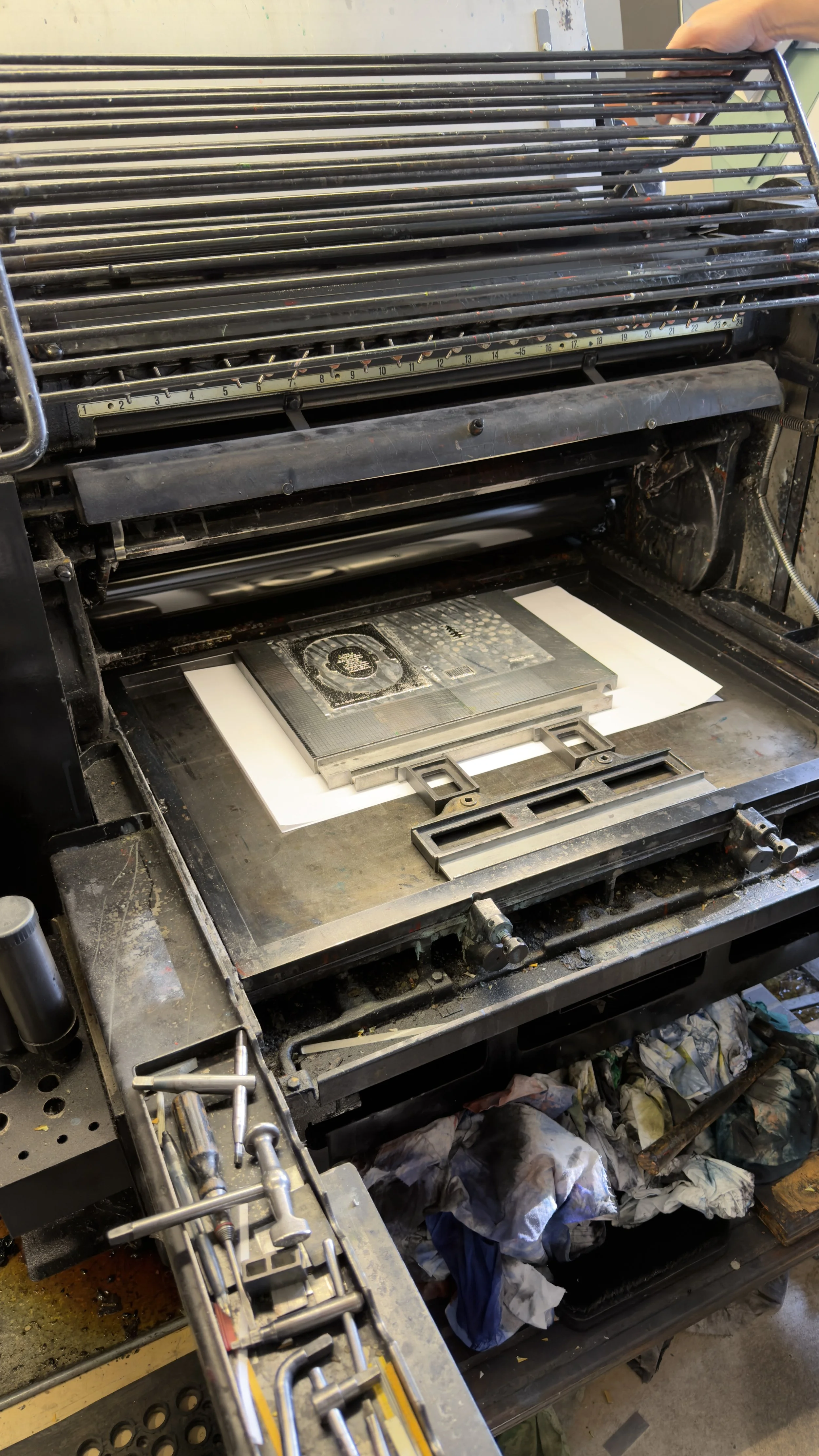
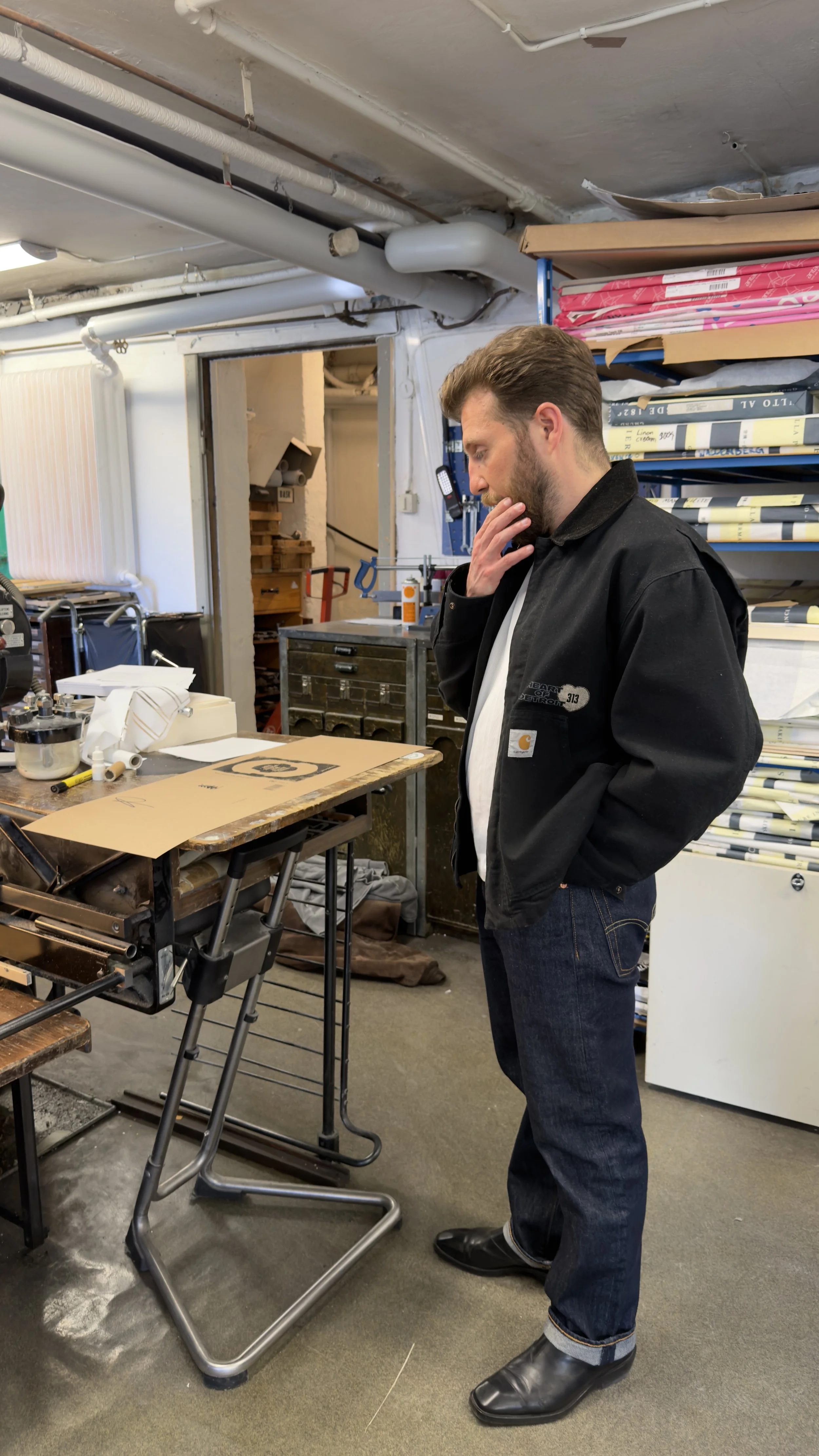
To truly capture the essence of the design, the dust jacket was printed at Norrbacka Tryckeri. By using letterpress machines from the 1940s, we achieved a physical depth and texture that perfectly matched the imperfect, raw aesthetic of the illustrations. By balancing these traditional techniques with a natural color palette and an A5 format, we created a book that is as much about the feeling of the paper and the ink as it is about the poetry itself.
Services
Art Direction & Collaboration
Book Design & Layout
Custom Illustration
Print Production Management