


Högbo Brukshotell
Högbo Outdoor
Högbo Brukshotell already had a visually strong mountainbike offering in place and wanted to expand their catalogue to include other outdoor activities. With Högbo Outdoor, we created a solid foundation for enveloping the strong MTB-brand already in place, as well as the new outdoor arenas. Created while working at Gomorron Advertising Agency.
Services
Graphic design
Illustration
Print production

The logotypes that were already in place.
Minding the Legacy
Expanding the hierarchical family in a way that would keep the look and feel intact was a no-brainer.
Högbo Brukshotell needed to be separate but related.
Högbo Outdoor would envelope the MTB-arena together with all other new arenas.

Högbo Outdoor
Högbo Outdoor echoes shapes from the Högbo H and the mountainbike tire, creating a visual connection to both.


The Arena Badges
Each arena gets its own badge and color scheme. Easy to distinguish yet visually unified, the logo becomes an effective communicator at their website and on-site locations such as maps and signs.
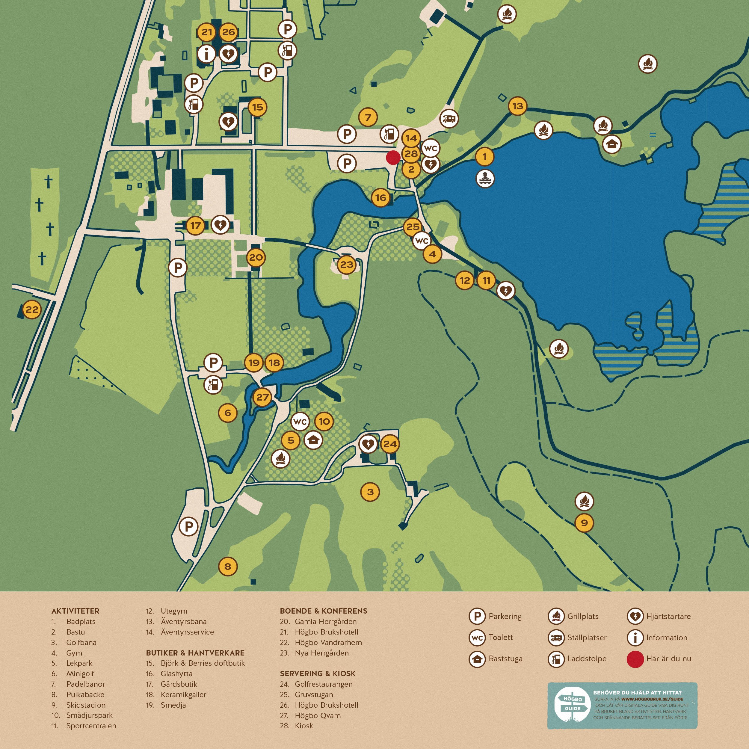
Map and Signs
At the entrance I designed a section of maps and signs for easy navigation and an introduction to Högbo Outdoor.


