A dirty wordmark and identity for the rock band DRUIN
-
Brief
The rock band DRUIN approached me to design a new logo and the full artwork for their self-titled EP launch. They were looking for a classic and timeless aesthetic, drawing inspiration from the iconic graphics of bands like Ghost and Kvelertak. The challenge was to create something that felt both heritage-inspired and unique to their specific sound.
Solution
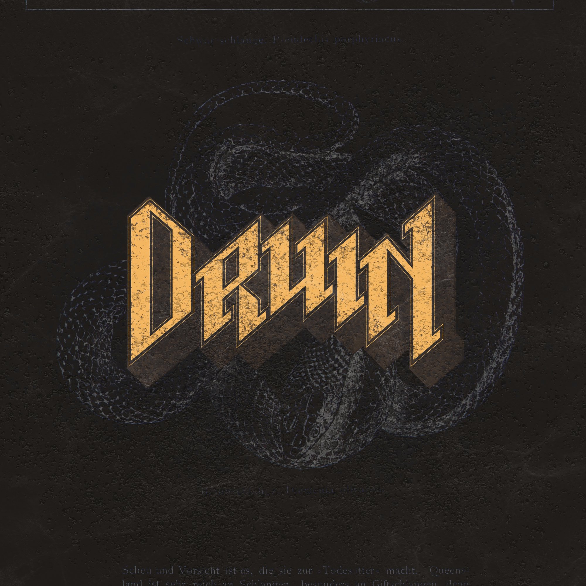
I developed a tight, custom wordmark designed to reflect the band's raw energy while maintaining high legibility across both digital and physical platforms. To achieve the right atmosphere, I created a library of custom grungy textures and hand-crafted artwork that echo the grit of the genre. By balancing sharp typography with organic, worn-down textures, I established a cohesive visual universe that spans from Spotify banners to screen-printed merchandise.Deliverables
Identity Design: I created the band’s core wordmark and visual language.
Cover Art: I designed the artwork for the EP and subsequent album releases.
Digital Assets: I produced Spotify banners and social media kits for the launch.
Merchandise: I developed t-shirt designs and physical assets for the band’s fans.